Monday, 30 April 2012
Reasons for locations, props, costumes and style
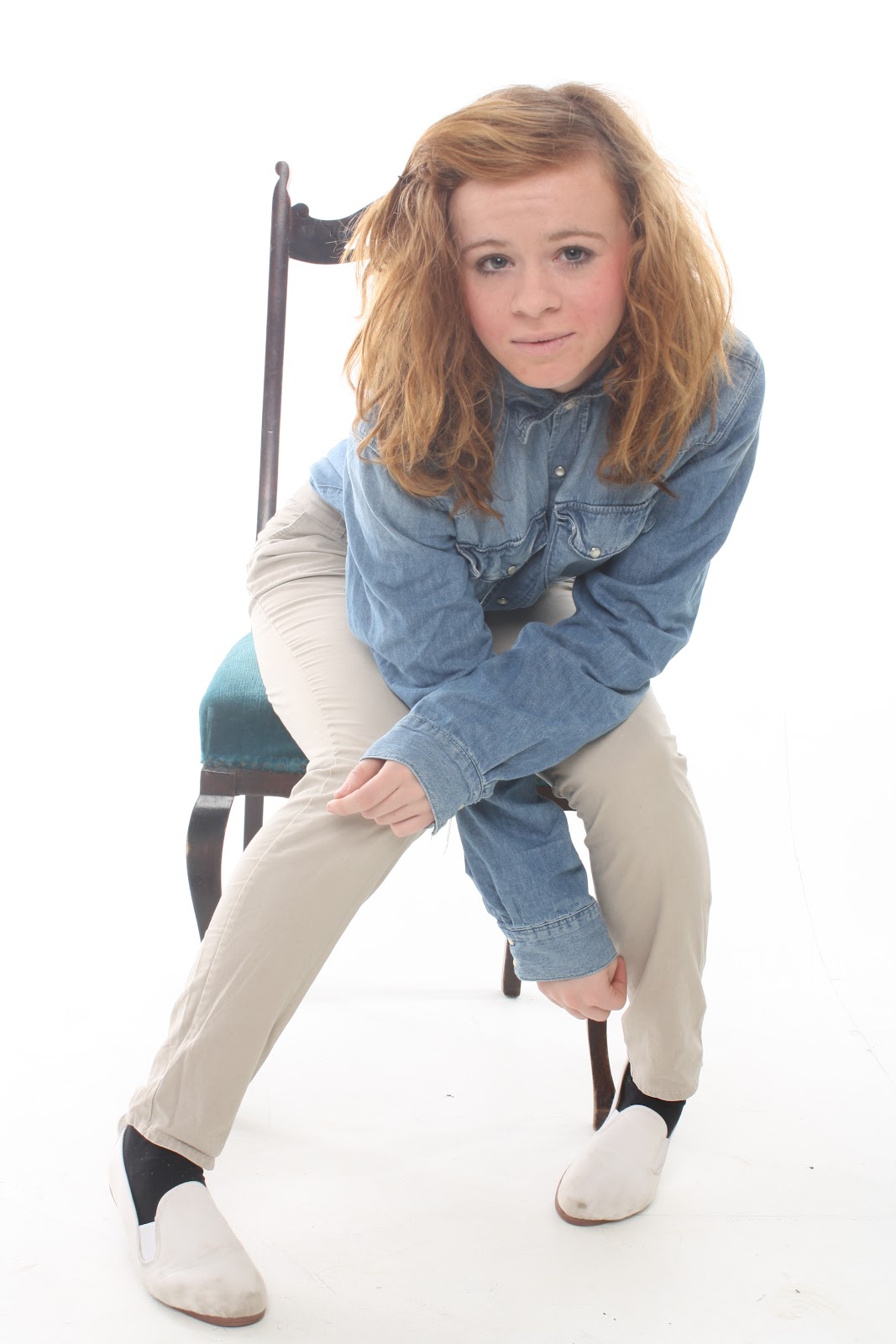
My location of the images used was just a simple photography studio so it had no background. I changed the lighting to a high bright light to get the bright white background of all my main images I did this so it did not attract attention away from my model so the viewer would focus on her more. But when I wanted the black background I simply lowered the light so there was basically only light on the model to attract attention to her. The only prop I used was the chair in one of my images which I used to make my model seem more relaxed to attract the more 'layed back' kind of audience who dont really care about anything. I used a simply skinny jeans and denim shirt for my model to wear as it made her look casual and not overdressed this helped me get the audience I want as it wont attract the audience who are all about the traditional 'glamour' look it will attract the ones who dont really care about how they look. Overall the style of my magazine is relaxed and layed back it is for an audience who have no worrys and just basically want to read a magzine that is not over powered with fancy over posed images.
First attempt of magazine cover

To get the type of text in the bottom right corner of the cover you simply go on to Photoshop type the text you want, after this you select your text and go to your tool bar to the right and select the tool 'outer glow' which is highlighted below.

Images for my magazine
Below are the images I have chosen for my magazine.
 I chose to use this image for my magazine cover as I though the model looked relaxed and not over posed which would attract the type of 'indie' audience I want as they do not care about the pose they will want someone relaxed who they can relate to. I also cropped the photo so it was only from the middle of the body upwards this was so the audience could focus more on the models face, I think that this image was good to use as the model is looking straight forward making the audience feel like she is looking dirsectly at them and attracting them to read the magazine.
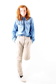
 I used this image for my double paged spread, I edited the photo so it was brighter like the image above and stood out more against the grey background that it was placed on. The reason I used this image was because again she is looking directly at the audience to attract them and it is also a very layed back relaxed picture. Also I liked the clothing worn by the model as a denim shirt and skinny jeans are normally what is worn by the type of audience I am looking for and would relate to them.

 I used this image as the main image on my contents page as it makes the model look upset, like she is quite enclosed and set away from everyone it makes the reader want to go on and find the interview in the magaazine with this 'singer' and find out if she opens up about why she looks so upset and closed off or if she will keep her problems to herself and give very blunt rehearsed answers.


I also used this image on my double paged spread but as a small image with the writing 'Reborn' down the side of it so it would look like an album cover. This would attract my audience as she looks very enclosed on the image and upset which makes the reader think that this album would be very deep and emotional. Also it adds a sense of realism to the magazine as in real magazines this is the type of thing you would usually see.

Tuesday, 10 April 2012
Font ideas for my magazine
 Before creating my magazine I tried various fonts until I got the correct one that I wanted to use. The font I used finally was Rockwell Bold which is shown to the right as it stood out the most and was a simple easy to read font and it fitted in well with the type of edgy magazine I was trying to create. Some fonts which I did not use were Times New Roman in Italic as it looked to formal for my magazine and like it should not be in this era of music, Comic Sans MS as it looked to childish and did not have the edge it needed for my magazine, and also Arial but that was too plain and boring for my magazine. These fonts are all shown below.
Inspiration of Q double paged spread

Inspiration of Q magazine contents page.

Inspiration of Q magazine cover

Subscribe to:
Posts (Atom)