Below are the images I have chosen for my magazine.
I chose to use this image for my magazine cover as I though the model looked relaxed and not over posed which would attract the type of 'indie' audience I want as they do not care about the pose they will want someone relaxed who they can relate to. I also cropped the photo so it was only from the middle of the body upwards this was so the audience could focus more on the models face, I think that this image was good to use as the model is looking straight forward making the audience feel like she is looking dirsectly at them and attracting them to read the magazine.

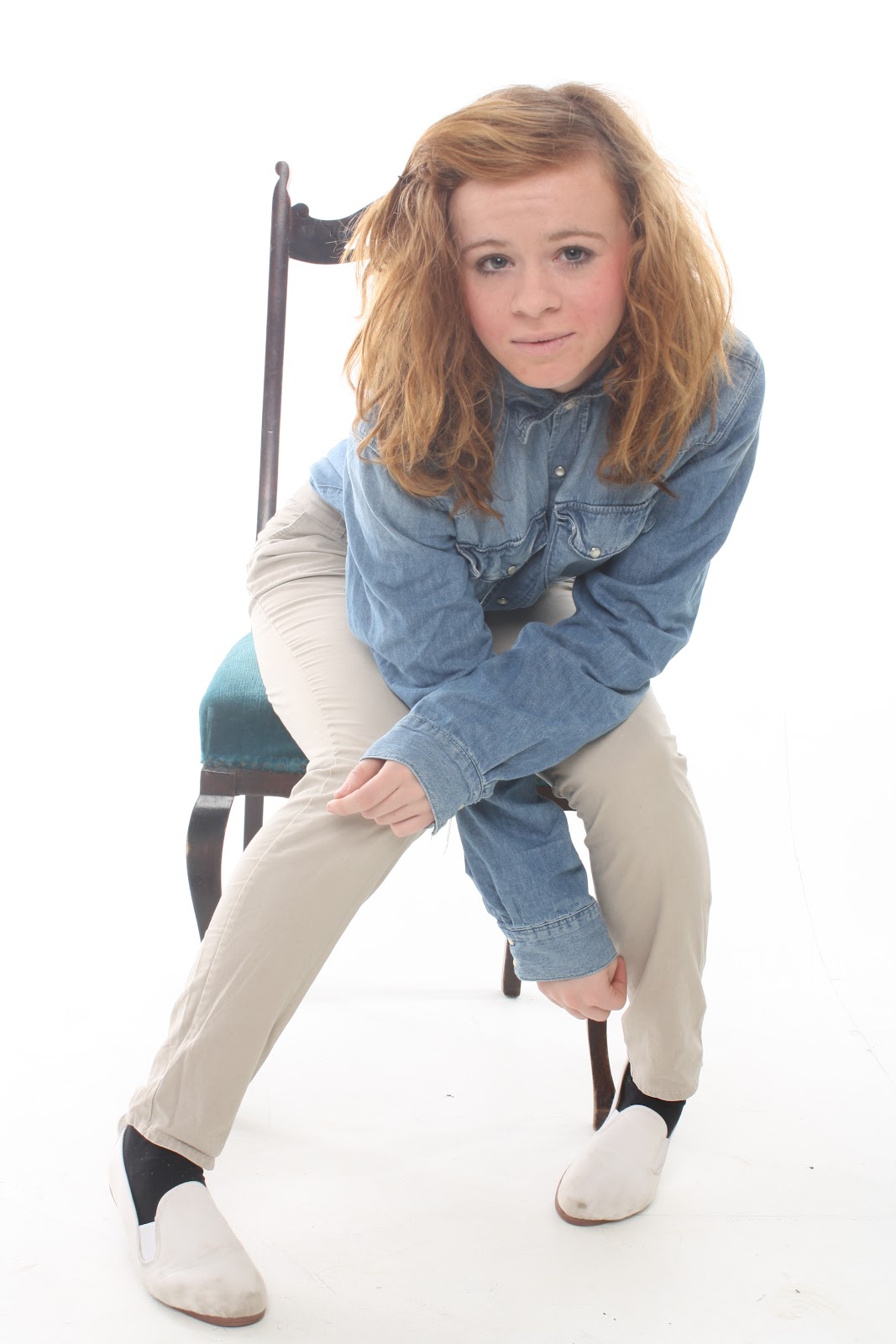
I used this image for my double paged spread, I edited the photo so it was brighter like the image above and stood out more against the grey background that it was placed on. The reason I used this image was because again she is looking directly at the audience to attract them and it is also a very layed back relaxed picture. Also I liked the clothing worn by the model as a denim shirt and skinny jeans are normally what is worn by the type of audience I am looking for and would relate to them.
I also used this image on my double paged spread but as a small image with the writing 'Reborn' down the side of it so it would look like an album cover. This would attract my audience as she looks very enclosed on the image and upset which makes the reader think that this album would be very deep and emotional. Also it adds a sense of realism to the magazine as in real magazines this is the type of thing you would usually see.
I used this image as the main image on my contents page as it makes the model look upset, like she is quite enclosed and set away from everyone it makes the reader want to go on and find the interview in the magaazine with this 'singer' and find out if she opens up about why she looks so upset and closed off or if she will keep her problems to herself and give very blunt rehearsed answers.


No comments:
Post a Comment